Data Preparation
GPS data visualization is useful especially the data contains extra information besides the coordinates, for example the velocity per sampling points used in running APPs, UE (User Equipment) measurements of signal quality of the mobile network etc., visualization of this kind of data in map can easily help to understand, and troubleshoot network problems.
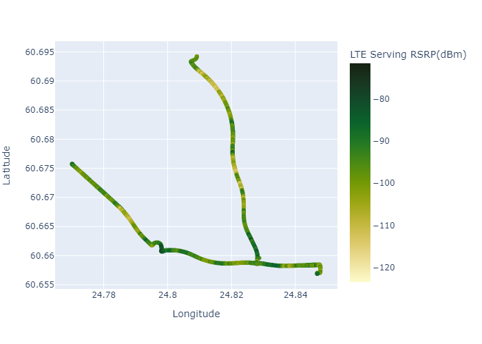
The example dataset contains the coordinates and its cooresponding measured LTE cell signal strength (RSRP - Reference Signal Received Power in dBm).
import pandas as pd

data = pd.read_csv('Data_RSRP.csv')
data.head()| Longitude | Latitude | LTE Serving RSRP(dBm) | |
|---|---|---|---|
| 0 | 24.846930 | 60.656944 | -99.50 |
| 1 | 24.846933 | 60.656943 | -87.56 |
| 2 | 24.846933 | 60.656943 | -86.44 |
| 3 | 24.846933 | 60.656944 | -87.50 |
| 4 | 24.846932 | 60.656946 | -91.75 |
The following function tries to map the measured signal stength (LTE cell RSRP in dBm) to different colors, therefore it can easily display where the mobile network coverage is good or bad.
def color_map(val):
    if val < -110:
        color = "#FF333C"
    elif val < -100:
        color = "#FF6133"
    elif val < -90:
        color = "#FFFF33"
    elif val < -80:
        color = "#A2FF33"
    elif val < -70:
        color = "#228E03"
    else:
        color = "#0E3B01"
    return color
data['color'] = data['LTE Serving RSRP(dBm)'].astype(float).map(color_map)
data.head()| Longitude | Latitude | LTE Serving RSRP(dBm) | color | |
|---|---|---|---|---|
| 0 | 24.846930 | 60.656944 | -99.50 | #FFFF33 |
| 1 | 24.846933 | 60.656943 | -87.56 | #A2FF33 |
| 2 | 24.846933 | 60.656943 | -86.44 | #A2FF33 |
| 3 | 24.846933 | 60.656944 | -87.50 | #A2FF33 |
| 4 | 24.846932 | 60.656946 | -91.75 | #FFFF33 |
Folium
import folium

mymap = folium.Map(location=[data.Latitude.mean(),data.Longitude.mean()], zoom_start=12)
for coord in data[['Latitude','Longitude', 'color']].values:
    folium.CircleMarker(location=[coord[0],coord[1]], radius=1,color=coord[2]).add_to(mymap)
import io
from PIL import Image
img_data = mymap._to_png(5)
img = Image.open(io.BytesIO(img_data))
img.save('folium_img.png')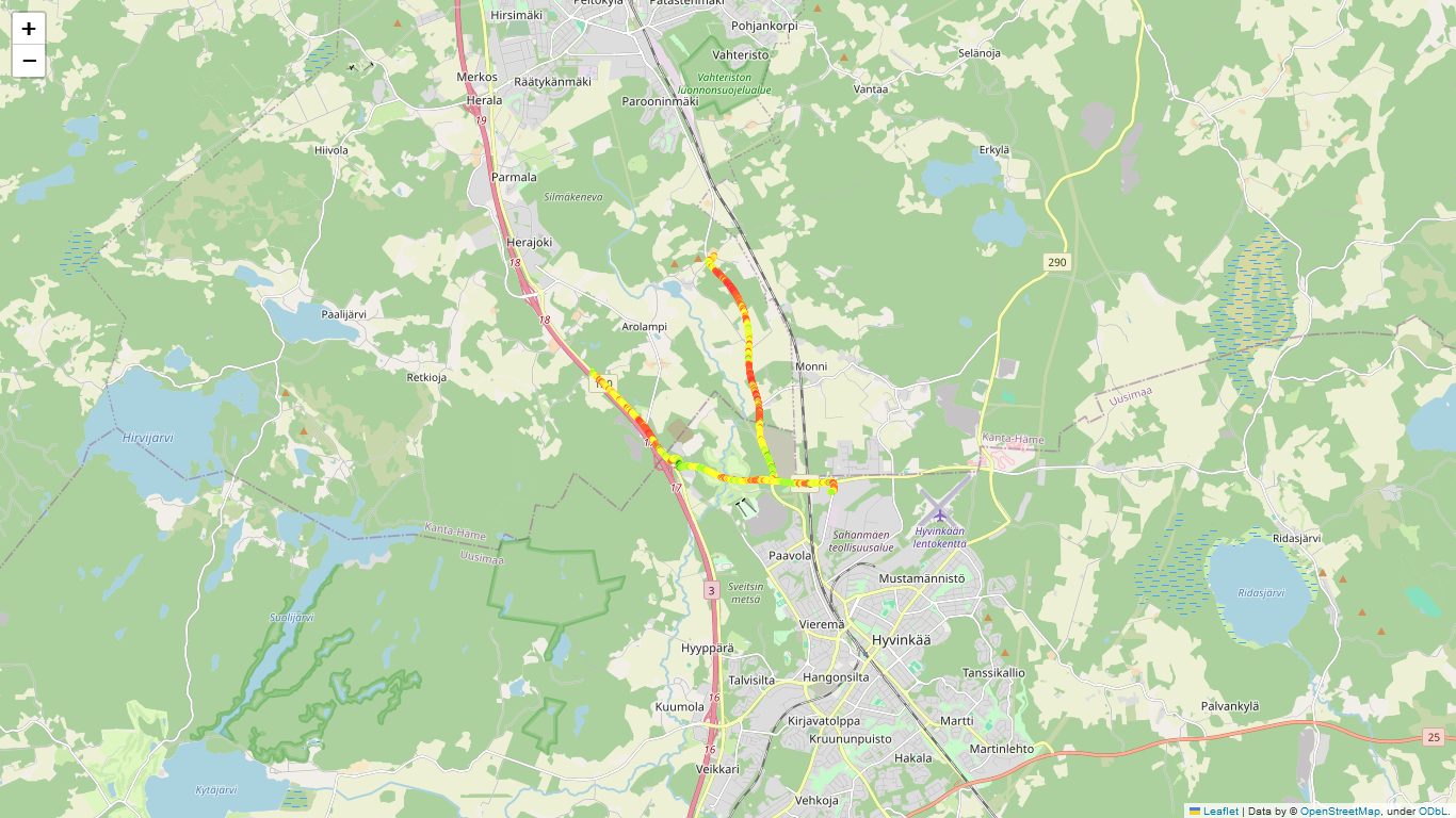
Plotly Express
color_continuous_scale is adjustable with built-in color scales on https://plotly.com/python/builtin-colorscales/
import plotly.express as px

fig_1 = px.scatter(data, x='Longitude', y='Latitude', color='LTE Serving RSRP(dBm)', color_continuous_scale='speed')

fig_1.write_image('plotly_img.png')