Load the list of S&P 500 companies from Wikepedia
import pandas as pd

def load_data(url):
    html = pd.read_html(url, header=0)
    return html
url = 'https://en.wikipedia.org/wiki/List_of_S%26P_500_companies'
df = load_data(url)[0]
df.head()
| Symbol | Security | GICS Sector | GICS Sub-Industry | Headquarters Location | Date added | CIK | Founded |
|---|
| 0 | MMM | 3M | Industrials | Industrial Conglomerates | Saint Paul, Minnesota | 1957-03-04 | 66740 | 1902 |
|---|
| 1 | AOS | A. O. Smith | Industrials | Building Products | Milwaukee, Wisconsin | 2017-07-26 | 91142 | 1916 |
|---|
| 2 | ABT | Abbott | Health Care | Health Care Equipment | North Chicago, Illinois | 1957-03-04 | 1800 | 1888 |
|---|
| 3 | ABBV | AbbVie | Health Care | Biotechnology | North Chicago, Illinois | 2012-12-31 | 1551152 | 2013 (1888) |
|---|
| 4 | ACN | Accenture | Information Technology | IT Consulting & Other Services | Dublin, Ireland | 2011-07-06 | 1467373 | 1989 |
|---|
Examing the data
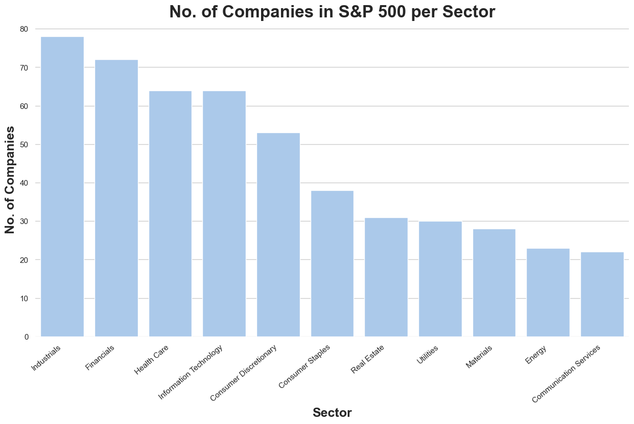
sector_unique = df['GICS Sector'].unique()
sector_unique
array(['Industrials', 'Health Care', 'Information Technology',
       'Utilities', 'Financials', 'Materials', 'Consumer Discretionary',
       'Real Estate', 'Communication Services', 'Consumer Staples',
       'Energy'], dtype=object)
sector = df.groupby('GICS Sector').agg(Count=('Symbol', 'size')).reset_index()
import seaborn as sns
import matplotlib.pyplot as plt
sns.set_theme(style = "whitegrid")
f, ax = plt.subplots(figsize=(15,8))
sector = sector.sort_values('Count', ascending=False)
sns.set_color_codes("pastel")
sns.barplot(x='GICS Sector', y='Count', data=sector, label='Companies per Sector', color='b')
ax.set_xlabel('Sector', fontweight='bold', fontsize=18)
ax.set_ylabel('No. of Companies', fontweight='bold', fontsize=18)
ax.set_xticklabels(ax.get_xticklabels(), rotation=40, ha="right")
ax.set_title('No. of Companies in S&P 500 per Sector', fontsize=24, fontweight='bold')
sns.despine(left=True, bottom=True)
Retrieve stock data using yfinance
import yfinance as yf
import warnings
warnings.filterwarnings('ignore')
data = yf.download(
tickers = list(df['Symbol']),
period = '1y',
interval = '1d',
group_by = 'ticker',
auto_adjust = True,
prepost = True,
threads = True,
proxy = None
)
[*********************100%%**********************]  503 of 503 completed

2 Failed downloads:
['BF.B']: Exception('%ticker%: No price data found, symbol may be delisted (period=1y)')
['BRK.B']: Exception('%ticker%: No data found, symbol may be delisted')
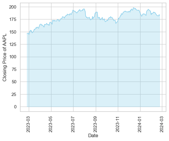
data['AAPL'].head()
| Price | Open | High | Low | Close | Volume |
|---|
| Date | | | | | |
|---|
| 2023-02-24 | 146.328931 | 146.408508 | 144.946312 | 145.931061 | 55469600 |
|---|
| 2023-02-27 | 146.925752 | 148.377992 | 146.667123 | 147.134628 | 44998500 |
|---|
| 2023-02-28 | 146.269261 | 148.288481 | 146.050427 | 146.627350 | 50547000 |
|---|
| 2023-03-01 | 146.050447 | 146.448318 | 144.240103 | 144.538513 | 55479000 |
|---|
| 2023-03-02 | 143.613439 | 145.931070 | 143.135977 | 145.135315 | 52238100 |
|---|
df_aapl = pd.DataFrame(data['AAPL'].Close)
plt.fill_between(df_aapl.index, df_aapl.Close, color='skyblue', alpha=0.3)
plt.plot(df_aapl.index, df_aapl.Close, color='skyblue', alpha=0.8)
plt.xticks(rotation=90)
plt.xlabel('Date')
plt.ylabel('Closing Price of AAPL')
Text(0, 0.5, 'Closing Price of AAPL')
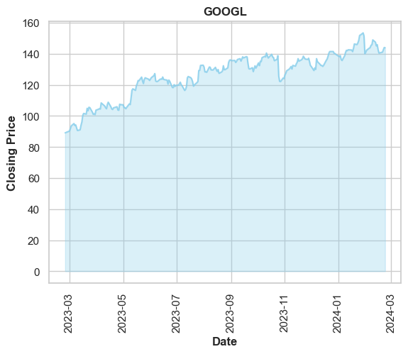
def price_plot(symbol):
df_symbol = pd.DataFrame(data[symbol].Close)
plt.fill_between(df_symbol.index, df_symbol.Close, color='skyblue', alpha=0.3)
plt.plot(df_symbol.index, df_symbol.Close, color='skyblue', alpha=0.8)
plt.title(symbol, fontweight='bold')
plt.xticks(rotation=90)
plt.xlabel('Date', fontweight='bold')
plt.ylabel('Closing Price', fontweight='bold')
return plt.show()
price_plot('GOOGL')